After revisiting an old post about seasonal trading and investing strategies, I decided to start looking at how to rebase time series in Python. It’s pretty simple considering I cheated and looked at Stack Exchange.
The Python code is simply this:
#!/usr/bin/env python
# coding: utf-8

# In[46]:


#https://stackoverflow.com/questions/36153944/pandas-creating-an-indexed-time-series-starting-from-100-from-returns-data
import pandas as pd
import numpy as np
import yfinance as yf
import matplotlib.pyplot as plt
import datetime as dt


# In[47]:


tickers =['SPY', 'EWM', 'EWJ', 'FXI']


# In[48]:


start=dt.datetime(2007,5,1)
end= dt.datetime.now()


# In[49]:


assets=yf.download(tickers,start,end)['Adj Close']


# In[50]:


assets_indexrow=assets[:1]


# In[51]:


for ticker in tickers:
    assets[ticker+'_indexed']=(assets[ticker]/ assets_indexrow[ticker][0])*100


# In[52]:


assets.drop(columns =tickers, inplace=True)


# In[53]:


plt.figure(figsize=(14, 7))
for c in assets.columns.values:
    plt.plot(assets.index, assets[c], lw=3, alpha=0.8,label=c)
plt.legend(loc='upper left', fontsize=12)
plt.ylabel('Value Change')
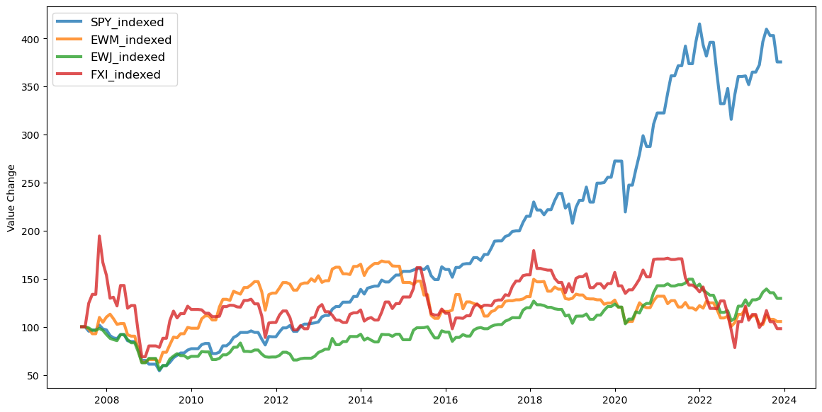
When you run it, it generates this neat graph that shows the SPY ETF out performing FXI, EWM, and EWJ from May 2007, the time when this “blog” / publication started.
I then decided to resample the time series using the following snippet of code:
assets = assets.resample('1M').asfreq().ffill()
Then I regenerated the graph for monthly a monthly basis and got this.
Overall, it’s a simple thing to do in Python and I’ll stick with this over the R Code, even though the R libraries have some nicer plotting abilities. The next trick is to convert the time stamps into monthly numbers and recreate what Eric did with his R Code in Python.
That should be easy, all I need to do is add these lines of code to the assets dataframe:
assets['year'] = assets.index.year
assets['month'] = assets.index.month
Done!
